Understanding where to place Google Ad units on your site is an important skill in optimising Adsense ads. Strategically placed ads will has very good chance of giving good results with Adsense. Lets discuss here how to find the optimum place for your ads, so that the visitor can see them and click them.
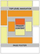
Google provides in its Adsense optimization demo what is called a "heat map". This is basically a diagram that shows the Adsense ad placement areas and their corresponding performance possibilites. Their recommadations seems to work in majority of the cases. Here is the diagram:
Google provides in its Adsense optimization demo what is called a
 "heat map". This is basically a diagram that shows the Adsense ad placement areas and their corresponding performance possibilites. Their recommadations seems to work in majority of the cases. Here is the diagram:
In this diagram the darker the area indicated, the better its performance will be. From this we can see the large banner that goes right above the primary content of the site has the highest chance of producing clicks. This map relies on the natural direction of readers gaze goes, namely from left to right, from top to bottom, we sustain the theory according to which the reader is inclined to grant more attention to content in these areas, being the first he lays eyes on, so the first choice for ads placement would be the top-left area of the page.
As a general rule the "top-left" area catch most of user attention and hense make good choices for Ad placement. These are usually considered the most readable sections (or worthy of interest) by a normal visitor. Interestingly, we can observer from this diagram that, the section right below the primary content is also a hot area. This is because the reader assimilates the section right below the end of an article, for example, as a continuation of the content, and would be drawn to learn more.
This strategy works in most case, but not in all cases and all kinds of websites.
Strategic ads placement is not just talk, it actually gives good results with AdSense. The best placement depends on other factors as well and changes from one page to other and also based the over all website layout, design and structure. And also on the type of visitors visiting the site.
Let us see some of the points that we need to keep while optimising Adsense Ad placement.
Visitors:
Majority of the visitors are just "scanners" and a smallet part are actual readers. That is why you should favour the areas that are most likely to be noticed at the first glance.
Design:
Also keep in mind of the "scanners". A design-related placement should optimize ads mostly for the "scanning" visitor.
Place your ads next to the eye-catchers on your page -- headlines, graphics, pictures, tables etc -- that direct your visitors' attention towards the areas they're placed.
A simple, uncluttered design for a page helps the best. It makes the page look clear, inviting, and better showing visitors' options to leave the page through one of the links that are more visible this way.
It is better if the ads have more free space around them.
Structure of the content:
Here we target the actual readers of the site.
Having a certain section of great interest on the page that the visitor will most certainly read means that the part of the page with that content will be most likely a good ads place.
Inserting your ads in the content, where they are the most contextually relevant is very effective, and results also in better ads targetting.
Keep the ads non-intrusive. A user should not feel that the ads are in their way. This won't do any good in terms of producing user clicks
Blind Areas
These are the areas that users usually ignore and thus produce very little results
The bottom-right area;
Outside of the readable content area; beyond the page footer and in the right extremity above the top level navigation (see the map with white areas);
The usual spot for banner ads -- don't place banner-shaped ads at the top or bottom of your page.
0 মন্তব্য(গুলি):
একটি মন্তব্য পোস্ট করুন